Quantel Asset Management
UI/UX Design | Fintech | Web Platform
Picture a busy executive with $500K or more in a retirement account. A big-name advisor manages it, and still they can't answer one question: am I actually on track? When the portfolio lags, nobody can explain why.
Quantel (formerly TenjinAI), an established offline wealth firm, brought in our design agency to serve exactly these accredited investors online. Operating as the dedicated Product Designer embedded with Quantel's leadership and engineering teams, my mission: turn dense quantitative data and a powerful AI engine into an institutional-grade platform they'd actually trust.
0 → 1
No design team, design system, or user flows at kickoff. Built from scratch.
3 in 1
Their 3 core services: Invest, Advise, and Insights combined seamlessly in a single unified canvas.
50%+
Returns delivered over 18 months across Quantel-managed portfolios.*
36.83%
A director's IRA in 12 months vs. 20% for the benchmark S&P 500.*
Project Scope
Role
UI/UX Designer (End-to-end: UX Research → Architecture → UI Design → System → Handoff)
Context
Client Project via TheSocialSlate
Team
Me, an intern designer, agency lead, with Quantel's CEO, Project Manager, 6 Engineers (4 Frontend & 2 Backend)
Timeline
1.5+ years from kickoff to MVP Release
Stack
Figma, FigJam, REST API Data Modeling, React Dev Bridge
quick Summary
Situation: Our design agency was brought in by Quantel, an offline wealth firm, to design their digital platform from scratch with no pre-existing design system, user flows, or internal design team, and an AI engine (they designed their own algorithm).
My Move: Set working rules that kept agency design and client engineering in sync, established a ticket-driven team pipeline, and architected a three-product platform designed directly around real API data.
Outcome: A launched MVP, well-structured design system, and clients who now feel they have the quantitative edge previously reserved for the ultra-wealthy.
What we walked into on day one.
Quantel's core users are accredited investors and people with $500K+ in retirement accounts. They want sophistication they can trust and clarity they can act on. Day one presented four distinct realities:
Brand
Already finalized by Quantel's agency. Fixed constraints to build upon.
AI Engine
Actively being coded by backend quant engineers. A moving target.
Design
No existing design team, component system, or flows. 100% greenfield.
Data
A mix of live and pending REST APIs, plus one test sandbox account the devs set up for us.
Six rules I pitched before the design phase
Drawing from my past handoff friction across projects, I pitched six foundational rules up front to Quantel's leadership and engineering leads. These rules kept all stakeholders honest and aligned throughout the engagement:
1
API reality check
Never design UI states that backend APIs cannot reliably deliver. Staying close to API specs eliminates costly late-stage rebuilds.
2
Desktop is a canvas
Take full advantage of 1440px+ screens without burying users in visual noise. Every pixel must earn its right to exist.
3
Design for launch day
For MVP, prioritize what is essential at launch, and what can be developed in parallel with design.
4
Trust the developers
Designer and developer trust is non-negotiable. Distrust between disciplines slows teams down more than any bug.
5
Lock the system at the right time
Lock tokens and components only after core layouts settle. Premature design systems create rigid waste and late systems create chaos.
6
Learn in fast loops
Use Quantel's existing offline customer base to validate assumptions fast. Move quickly, iterate with real feedback.
We binned the textbook process!
With Quantel's CEO, product manager, backend quant developers, frontend engineers, and agency leads collaborating across teams, standard academic UX templates fell apart. Instead, we co-designed our pipeline: each team specified how they work best, and we forged those preferences into a unified ticket-based agile workflow.


What we knew, what we assumed, what we had to learn
Even though our goal for the project was very clear, we still decided to do some deep research to understand what we knew about the users, what we assumed about the market, where users were actually struggling, and what features could meaningfully meet them. This matrix then became the source of truth for every design decision that followed.
I summarized the insights of our research in a table below:

We also benchmarked Acorns, Wealthfront, Wealthsimple, and Robinhood. While each commands a distinct niche, none pair deep AI advisory with professional research tools. Quantel had the data, the experts, and the engineers to do both, bringing hedge-fund-style discipline, usually reserved for institutions and the ultra-wealthy, directly to individual investors.
The Core Insight
The platform's real job wasn't to show more data.
It was to give serious investors clarity they could trust, and control they could keep.
final designs, critical design decisions & directions
The Main Dashboard
This is the screen users open every morning, coffee in hand. It needed to surface immense analytical depth without ever feeling visually overwhelming.
Three-column desktop architecture: After intense team debate over layout efficiency, the navigation bar and side utility rails stay anchored while only the central analytical feed scrolls. Essential controls never slip out of reach.
Split by intent, not by feature: Instead of confusing financial product names, the top navigation mirrors exactly what users are thinking when they log in:
Invest
"Just manage my money and grow it for me."
Advise
"Guide my strategy, but I keep the steering wheel."
Insights
"I am here to conduct high-conviction research."
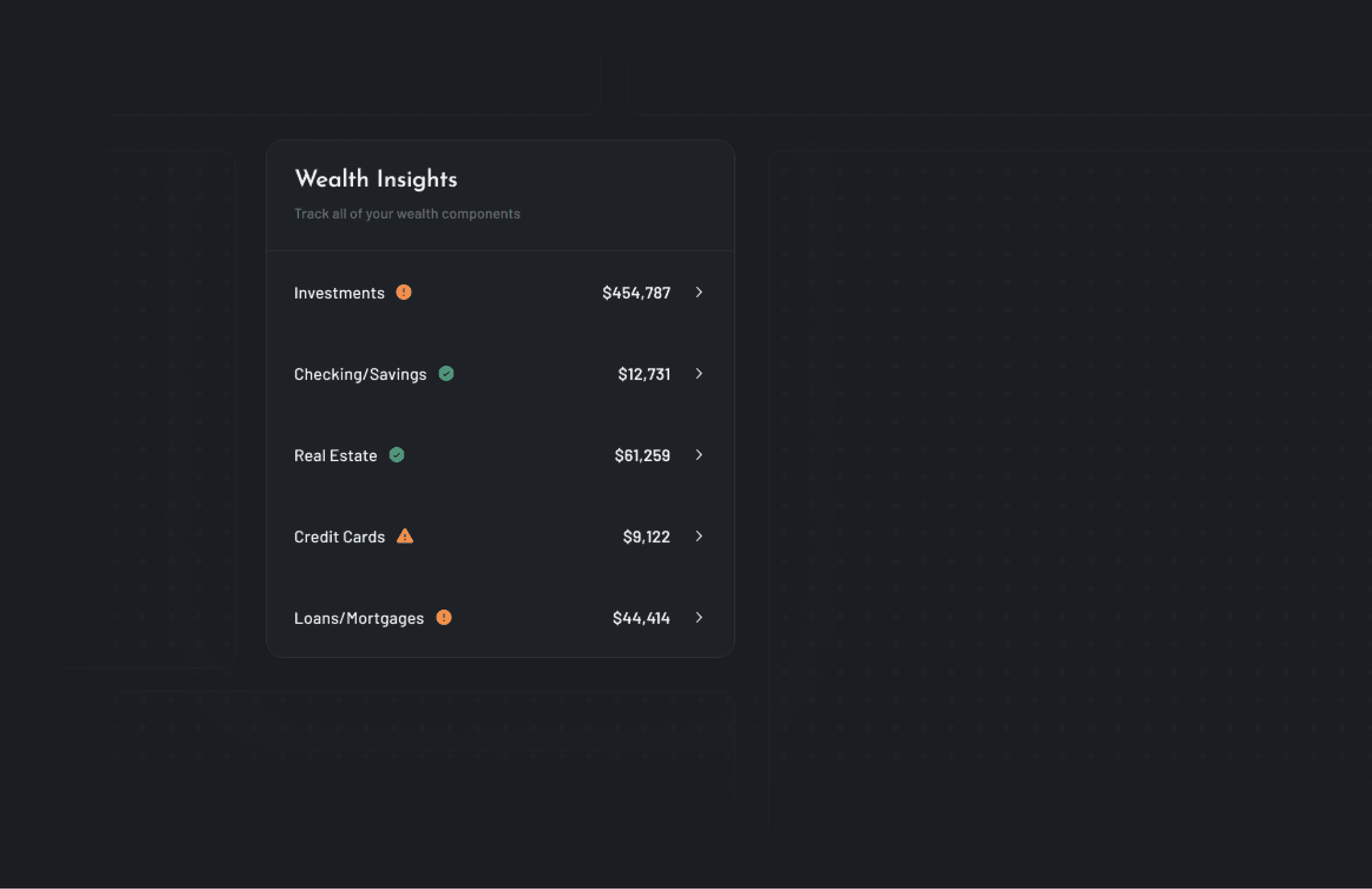
One job per widget: Highly complex portfolio distributions were modularized into clean, scannable cards: historical return vectors, macro market awareness, strategy discovery, and aggregate portfolio health scores.

Digestible widget close-ups


Quantel invest
Invest: The heart of the product
For users seeking automated wealth management, the experience needed to feel effortless without feeling careless. In an intensive Friday team session with the CEO and the developers, we interrogated two pivotal questions:
What is the AI actually trained to handle and how reliable is it? and
How much control does the user have and where?
The core design verdict: The AI is an intelligent negotiating partner, never a black box dictator.
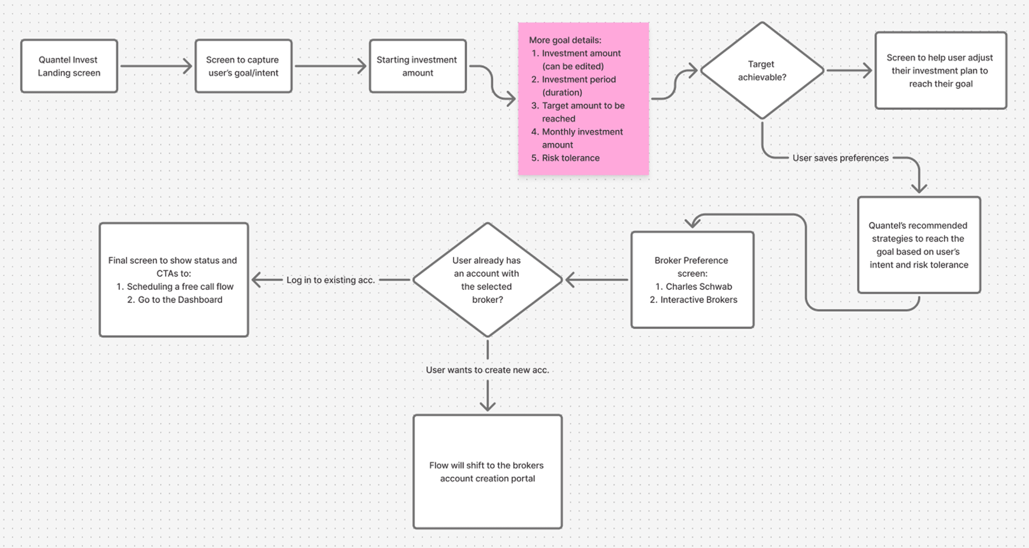
It meets you halfway: The flow initiates from the user's articulated life intent. If their targeted return isn't mathematically realistic within their timeframe, the algorithm proposes calibrated adjustments and a tailored portfolio mix—instead of flashing a demoralizing red error screen.
You keep the wheel: Investors can fine-tune asset allocations in real time. The AI acts as an active guardrail, providing gentle visual warnings if changes drift outside acceptable risk limits.
SIPC custodial safety: Users connect reputable brokerage custodians (including Interactive Brokers and Charles Schwab) under their own personal legal name. Quantel manages algorithmic rebalancing and trade execution, but only the client can withdraw or move funds.
Quantel Advise
Advise: Earning trust before asking for access
Designed for the "guide me, but I'll drive" mindset: securely connect an existing brokerage account, receive an instantaneous quantitative AI audit, and schedule 1-on-1 sessions with Quantel's licensed advisors.

The account linking challenge: Before we started the design for this part, we had to understand something that would help us in our process: How US brokerages actually work? The US model is wildly different from India's, and the difference is the entire product.
So another long session with the CEO and the backend team, we came out with insights that then helped us shape Quantel’s Advisory flow and design different states for this flow.
Insights
The US financial architecture runs on a "trust but verify" model, backed by the SIPC, which functions as a quiet insurance policy for every user's account.
The implication for design: if we surface this clearly, the user stops worrying about whether their money is safe, and starts engaging with the product itself.
The Six-Factor Health Diagnostic: The platform renders a diagnostic lab report analyzing the user's holdings across six core pillars: Performance, Diversification, Growth Potential, Stability, Financial Health, and Downside Risk. This bridges directly into an automated consultation booking calendar and a Central Reports Hub, preserving an audit trail of every past recommendation.

Linked Account analysis screen
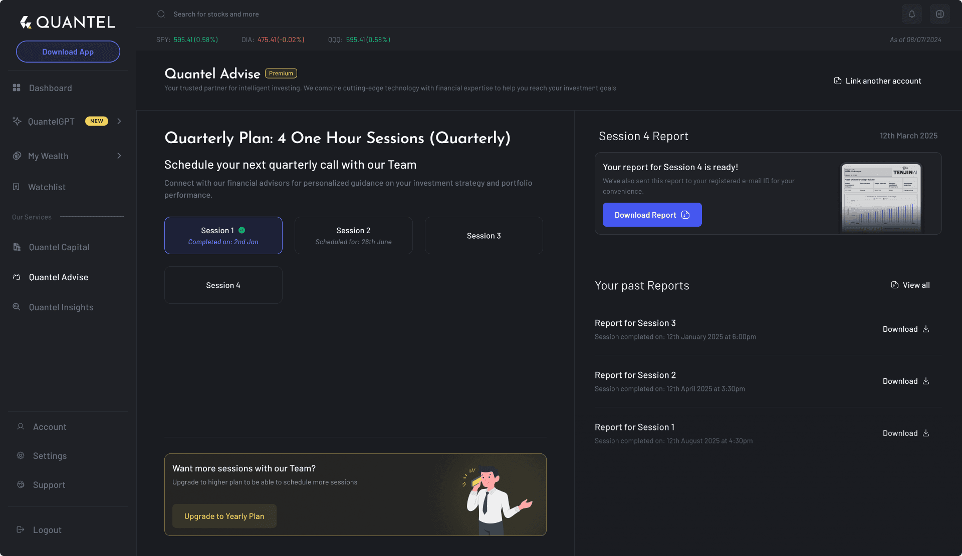
Advisory session booking screens
A central hub for every report:
In their offline sessions, after each advisory session, Quantel’s experts create a detailed report for the user’s portfolio. When ready, this report is then sent to user via email or other means. So for the WebApp, we wanted to offer the user a central place for all the reports where users can view, download, and compare every past portfolio audit in one place.


Quantel insights
Insights: Making an AI's confidence readable
Quantel Insights is the platform's research powerhouse. While Invest and Advise focus on management, Insights is where Quantel's proprietary AI truly shines, it tracks thousands of stocks across S&P 500 and NASDAQ in real-time to deliver actionable insights.
Goal: the depth of a professional research tool, in an interface, that a busy executive can read at a glance.

We designed the Insights landing page to act as a discovery engine.
(And for non-subscribers, this page showcases the AI's potential and clearly marks what's behind the paywall.)
Discovery categorized by investor intent: Curated thematic baskets such as High Growth, Value Plays, and Dividend Kings. Non-subscribers can freely preview algorithm ratings, seeing immediate value before crossing subscription gates.
Color-coded confidence indicators: Clear, unambiguous signals show Long, Neutral, or Short alongside relative alpha vs. benchmarks.
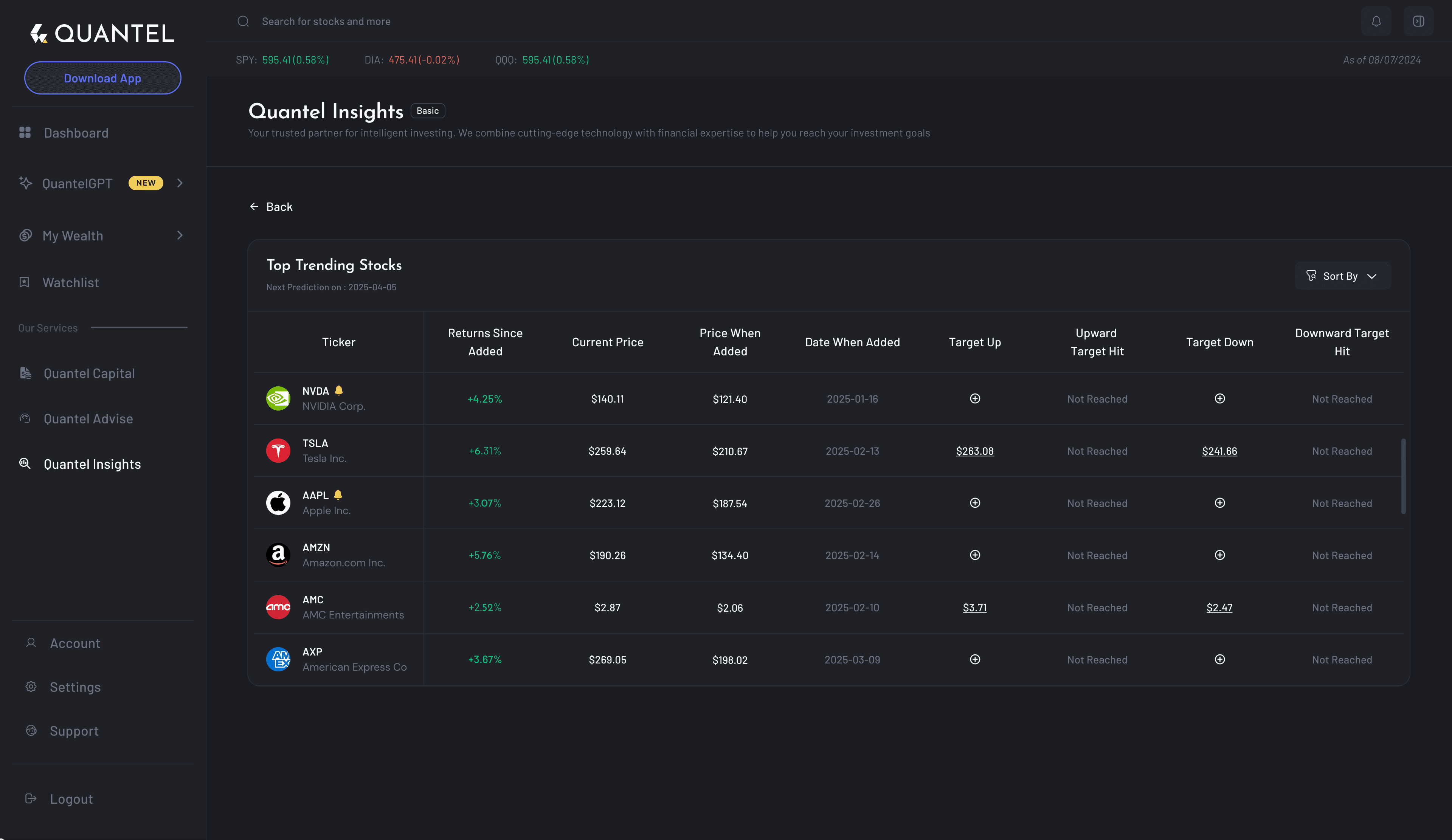
Dense yet rapidly scannable: Multi-tiered filters for market cap, sector rotation, and risk-adjusted volatility enable investors to cross-examine AI recommendations against their personal hypotheses.
Zero context switching: Comprehensive asset detail overlays keep technical chart analysis inside Quantel, eliminating the need to jump to TradingView.
Asset Details Screen
A key part of our "All-in-One" vision was ensuring that users never had to leave the Quantel ecosystem to perform deep technical research. Typically, investors jump between their brokerage and platforms like TradingView to analyze charts and this didn't align with the business goal.

foundations
My Wealth and Watchlists
My Wealth consolidates all linked assets, real estate valuations, and liabilities into one unified balance sheet, binding the three products into a coherent financial operating system.


Watchlists: In a market that moves every millisecond, clarity is a feature. We kept the watchlist UI extremely clean, using a table-based layout that prioritizes scannability.

importance of understanding apis
Why understanding “How APIs work” is important for designers
APIs define how data is requested, received, and updated, so knowing their structure allows designers to anticipate loading states, error handling, and data limitations or any potential constraints. It helps us design interfaces that are both user-friendly and technically feasible. This also leads to more realistic wireframes, smoother collaboration with developers (trust me, the devs will thank you for this!), and overall a better user experience.
How we used API data
Our developers had setup a Dummy user account for us (for testing/audit) and also provided us with the raw API Json data for the screen we demanded.
Our goal was to reduce cognitive load and surface the most actionable financial info first.
Let’s consider the Credit Card details screens for example, although the raw JSON data has many technical details, a user typically cares about -
What do I owe?,
When is it due?,
How much interest am I incurring?

How we leveraged this data to our benefit?
We categorized this data into several groups. We first collected all important data necessary to be shown in the UI, then further categorised them into more specific groups as shown in an example below:

Insights
This activity, helped us to quickly get answers to questions like:
What data is requested?
What data is Updated?
How frequently the UI needs to be refreshed?
What structure should it follow?
What information is to be prioritized (<- the most important one!)
Mapping the API data to the Frontend
We then started designing the UI and mapping the data points. We clearly documented → “which field in the API response data drives what content in the UI design”. This helped us prioritize information easily.

Business & Client Impact
What happened after launch
Quantel successfully launched the MVP into the hands of real capital investors. The combination of high-powered quantitative models and clear, human-centered UI drove remarkable quantifiable outcomes:
50%+
Returns delivered over 18 months across Quantel portfolios, systematically beating benchmark indices.
36.83%
A director's IRA expanded from $1.11M to $1.52M in 12 months, versus ~20% for the S&P 500.
5 Yrs
One client is now on track to retire a full 5 years ahead of their original schedule.
Client Feedback
“I went from feeling overlooked by conventional 60/40 advisors to feeling like I finally have real advantages.”
— Quantel client & Fortune 500 corporate director
From overlooked to equipped: Clients shifted from generic robo-advisors to having personalized quantitative algorithms working on their behalf.
Proactive oversight: Whether self-directed or Quantel-managed, users now perform on-demand health checks, identify downside concentration risks, and adjust immediately.
"The returns belong to Quantel's quantitative strategies and AI engine. Design's responsibility was to make those models intuitive, educational, and trustworthy enough that people actually trusted them with their life savings."
conclusion
My learnings and reflections
1
Co-design the process
Rigid academic UX frameworks buckle under agency-client speed. Allowing engineering, design, and client leadership to co-author the workflow yielded vastly superior velocity.
2
Engineering literacy is a superpower
Understanding API schemas, latency, and data types allowed me to intercept technical bottlenecks before drawing mockups, saving weeks of dev rework.
3
Trust is an active deliverable
Working directly in developer tickets and respecting API constraints built immense goodwill. The engineers became design's strongest internal champions.
4
Prioritization is the whole job
When handling dense quantitative datasets, true design craft isn't hiding data behind menus—it's establishing intuitive visual sequencing that makes decision-making effortless.
Thanks for reading till the end!
If you like how I lead client product engagements across design, data architecture, and my engineering execution, check out a case study on a product I built and shipped using AI: