Overview
Quantel Asset Management (formerly TenjinAI) came to us with a clear mission: take their years of wealth management expertise and turn it into a premium digital experience. They weren't just looking for another investment platform, they wanted to bring their expertise to more users online.
By integrating an advanced AI algorithm with expert-led strategies, we set out to build a powerful toolset that allows users to manage, analyze, and grow their wealth in a single, unified ecosystem - instead of juggling five tabs and a spreadsheet.
THE CHALLENGE
Transform a successful offline wealth management operation into a digital platform that feels approachable for beginners and powerful enough for seasoned investors.
What we walked into on day one.
Branding: Logo and branding were already done by a their branding team, so brand wasn’t ours to define.
Backend: The backend team was deep into building Quantel’s custom AI / ML engine for investment guidance.
Design: There was no design team, no design system, no product flows. Everything was greenfield.
Data: Some APIs were already live, while some were still under development by the backend engineers. (The devs also had set up a dummy account for us to test)
Some rules we set before starting the design phase
Drawn from my past experience working with developers, I knew the problems and constraints that occur during the implementation phase, so I proposed a set of rules beforehand to the team and these kept us honest throughout the engagement.
API Reality Check: Don't design features whose APIs don't exist and where workarounds are too costly. Stay close to engineering; it also saves the build time.
Desktop is a Canvas: Use the desktop's space efficiently. Show what the user needs without burying them in noise.
All Vision, No Execution: For MVP, only design what is essential at launch, and what can be developed in parallel with design.
Trust the Developers: Designer and developer trust is non-negotiable. From my handoff experience: a lack of trust is the most destructive force on a team.
Early Design System: Lock the system down after the overall layout and structure are finalized, not before, not after.
Learning Loops for MVP: Use Quantel's existing offline customer base to validate assumptions fast. Move quickly, iterate with real feedback.
Our Process
As this was a complex project, involving other teams and members like the CEO, project manager, frontend and backend engineers, even stakeholders etc.., we knew that the standard "UX Design Processes" won’t work for us, instead our process needed to be more systematic, elaborative and well defined phase-by-phase.
So we defined our own process, we sat down with the team and decided upon a flow by having each team suggest a workflow that was easier for them to follow, we connected all of these together to form a single unified pipeline
There were many more steps involved in-between, but below I just showed a high-level view of how we worked and handled tickets in our workflow.
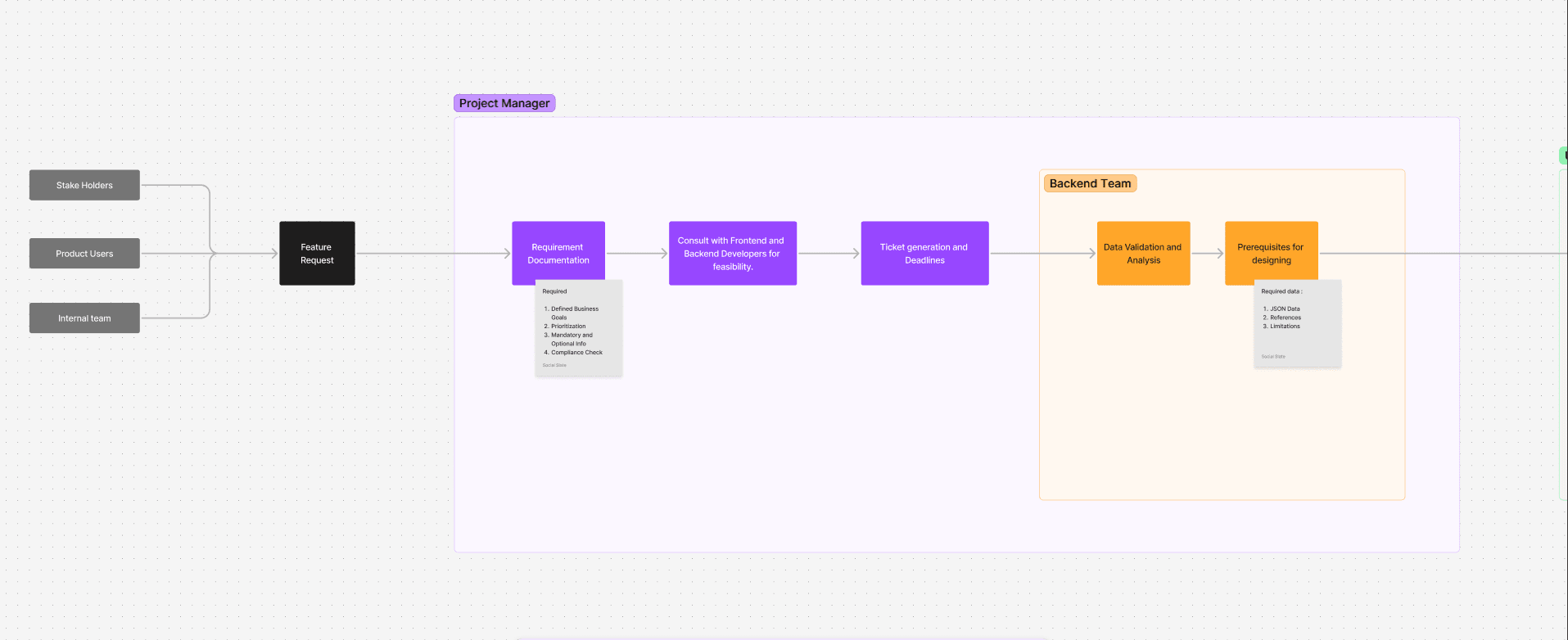

The frontend team also had their own detailed workflow, the one below is just a high-level representation of it.

What we knew, what we assumed, what we still had to learn.
Even though our goal for the project was very clear, we still decided to do some deep research to understand what we knew about the users, what we assumed about the market, where users were actually struggling, and what features could meaningfully meet them. This matrix then became the source of truth for every design decision that followed.
I summarized the insights of our research into a table below
METRIC / INFORMATION
BUSINESS PROBLEM
(OUR ASSUMPTIONS)
USER NEED
OPPORTUNITY / FEATURE
56% of investors have accounts across multiple brokerages
Need a solid value proposition to make people shift to or start a new Quantel-managed account
A way to understand how Quantel's advanced, data-driven strategies outperform the alternatives
A side-by-side strategy comparison tool that quantifies the gap between Quantel's data-driven strategies and the user's current allocations - transparent, plain-language reasoning that builds trust before any commitment
42% of US adults don't invest in the stock market at all
Most wealth platforms assume prior investment knowledge
Simple guidance, or a fully-managed option for users who don't want to learn investing
AI-driven advisory for everyday decisions, plus a fully managed account for users who want a 'set it and forget it' partner, Quantel as a personal wealth assistant
67% of non-investors say fear of losing money or making mistakes is the #1 reason they don't start
People often end up in the wrong investments for their profile, with poor long-term performance
A trustworthy, clear starting point for investing from day one
An in-product research portal: explore stocks, build conviction, and let Quantel's AI guide research in plain language, all without leaving the platform
High LTV, incomes, savings, and investments all ramp over a lifetime
Early balances are small; meaningful monetization is delayed by years
A platform that grows with them, from first savings, through career growth, to retirement
Hook users in with their full wealth picture, then surface how Quantel can improve it, side-by-side performance comparisons turn abstract data into a clear next step
41% of current HNI's became wealthy in the last 5 years, "new money" is the fastest-growing segment
If we don't capture them early, they default to competitors and rarely switch later
Different entry journeys, not everyone is ready to be fully managed on day one
Let users start where they're comfortable: explore, learn, link an existing account, or open a Quantel-managed account when they feel confident. No forced funnel, no premature commitment
We benchmarked the usual suspects - Acorns, Wealthfront, Wealthsimple, Robinhood. Each one carved a niche. None combined deep AI advisory with professional research tools. Quantel had the data, the experts, and a team of talented engineers to actually pull it off.
We saw an opportunity to bring the kind of active management and dynamic risk strategies, typically reserved for the wealthiest individuals to a broader digital audience, making institutional-grade investing accessible to more people.
The barrier was never the money, it was confidence
Quantel's users aren't broke. They're busy, overwhelmed, and unsure where to start, people with money sitting in savings and a quiet worry that they're doing it wrong.
So the platform's real job wasn't to display charts. It was to make an intimidating world feel approachable, educational, and safe, while building enough trust that a hesitant first-timer takes the leap and stays for the long run.
Below are some final designs and critical design decisions/directions that helped us shape our path to the MVP release
The Main Dashboard
The dashboard is the screen users open every morning, coffee in hand. So it had to pull off something genuinely hard: show a lot, without ever feeling like a lot.
We spent real time arguing about screen real estate before landing on a three-column architecture. The side columns and top bar stay fixed; only the center scrolls, so navigation and key tools never leave the user's reach.

We gave Quantel’s three core services each their own dedicated home in the top nav. Instead of blending features together, we let the UI mirror the user's intent the moment they arrive:

Invest
“Just manage my money for me.”
Advise
“Guide me, but I’ll drive.”
Insights
“I’m here to research.”
Splitting the product by intent is what let a genuinely complex platform feel structured and easy to navigate from the very first click.
Complex Data, Digestible Widgets
Financial data is dense by default. Our biggest challenge was to show this dense data without overwhelming the user. We went with modular widgets that break information into digestible, actionable insights, each one doing one job and doing it well.

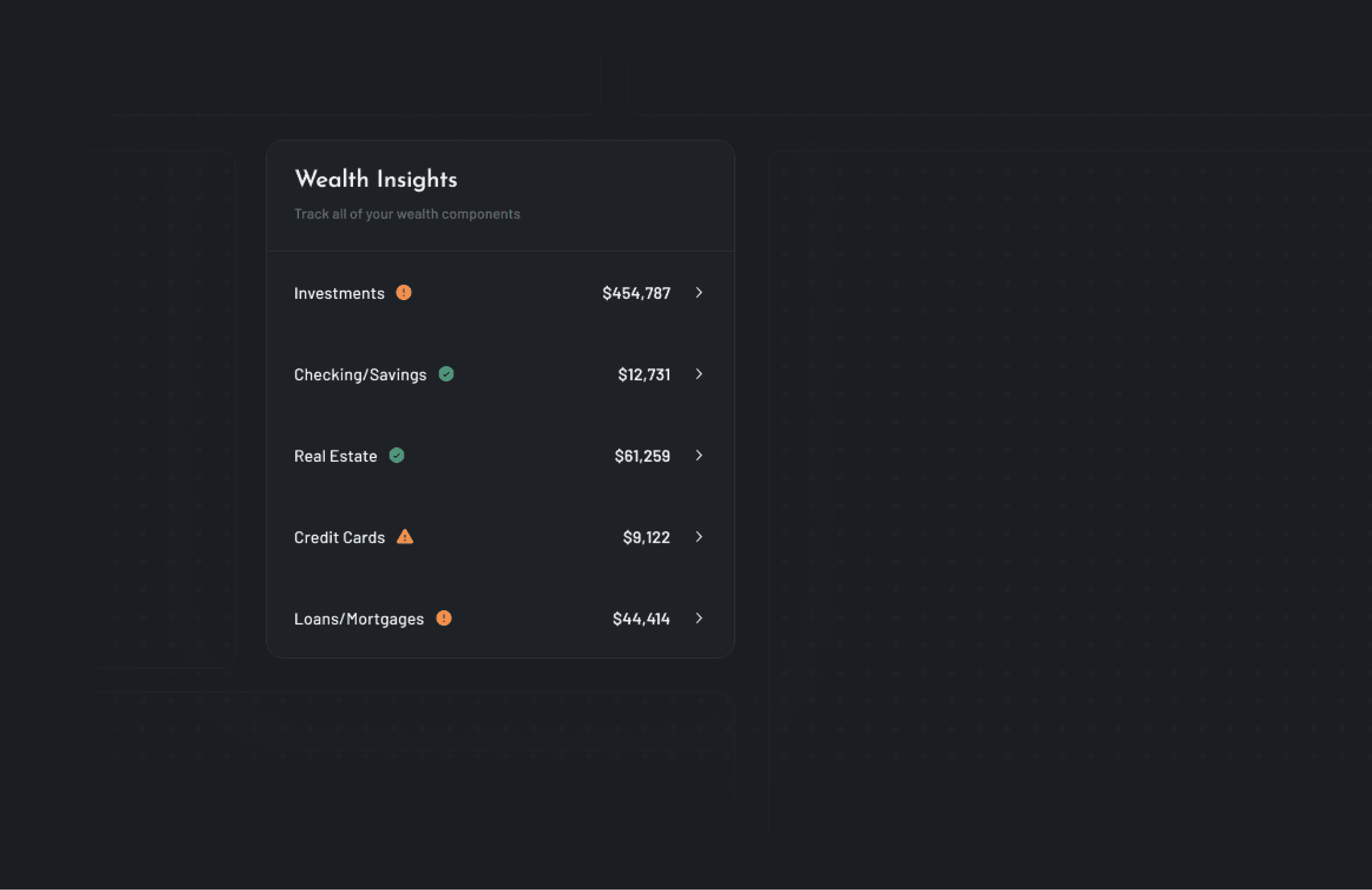

We designed these widgets such that they give the user quick insights about:
Portfolio performance
Market awareness
Strategy discovery
Financial health insights
Quantel Invest
With the dashboard in place, we turned to the heart of the product: Quantel Invest. This is the path for the users having a persona of: “just take my money and make it grow”, and so it had to feel effortless without ever feeling reckless.

So in another Friday team meeting (with CEO and developers), we discussed 2 important things:
What part of this process is the AI model currently trained to handle and how reliable it is?
andHow much control does the user have and where?
With AI being used, we wanted something that felt automated and genuinely intelligent, but never reduce the user to a passenger staring at a black box.
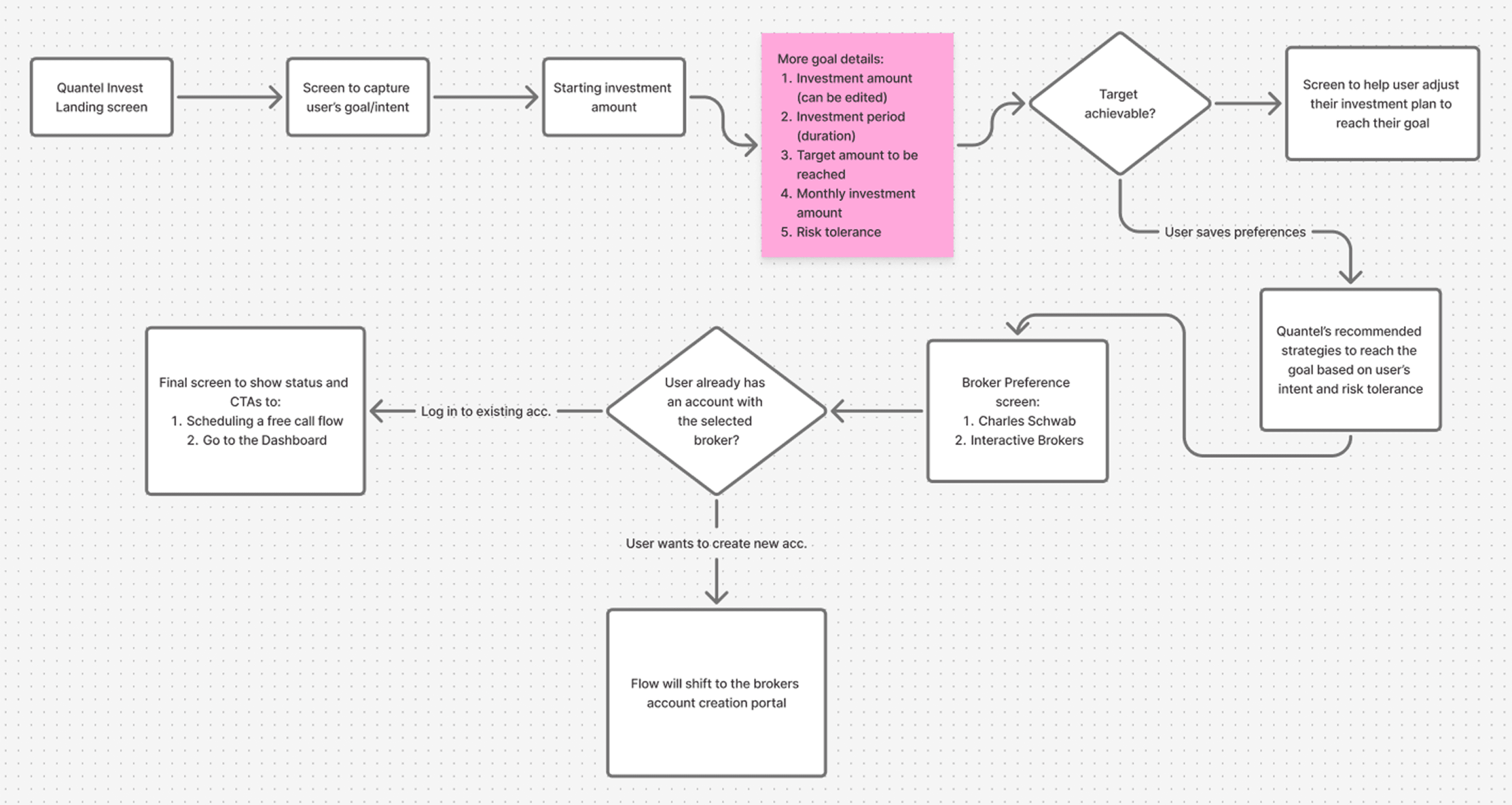
Video Walkthrough of the Quantel Invest - Account creation flow (figma prototype)
The user stays in the driver's seat. We capture intent up front. If a goal isn't achievable, the AI suggests real-time adjustments and proposes a personalized strategy mix. The user can re-allocate freely, but the AI acts as a guardrail, nudging them back if edits drift outside their stated risk tolerance.
AI as a collaborative partner
The design principle that fell out of those conversations: the AI should negotiate, not dictate. The moment a user's target looks unreachable from their inputs, the flow doesn't end there, it proposes real-time adjustments and a personalized mix of Quantel Strategies to close the gap.

It meets you halfway
If the math doesn't work, the AI suggests tweaks and an allocation tuned to your intent and risk, instead of just flashing a red “no.”
You keep the wheel
Re-allocate freely. The AI stays on as a guardrail, gently flagging when your edits drift from your stated risk tolerance, so the final plan stays viable.
From there, the flow hands off cleanly: the user picks a broker, logs into an existing account or spins up a new one, and they are presented with a detailed view of their portfolio (which I can’t show here as they are Quantel's proprietary insights).
Quantel Advise
Some users don't want their money managed for them, what they want is a professional-grade audit of their existing financial health. Quantel Advise is for them: link your existing portfolio, get an AI-driven analysis, and book a session with a real Quantel advisor.

The Linking Challenge
Before we started the design for this part, we had to understand something that would help us in our process: How US brokerages actually work?
The mental model is wildly different from India's, and the difference is the entire product.
Another long session with the CEO and the backend team, we came out with insights that then helped us shape Quantel’s Advisory flow and design different states for this flow.
KEY INSIGHT
SIPC & The Trust Economy
The US system runs on a "trust but verify" model, backed by the SIPC, which functions as a quiet insurance policy for every user's account. The implication for design: if we surface this clearly, the user stops worrying about whether their money is safe, and starts engaging with the product itself.
Linked Account analysis screen
This screen shows the Analysis of the user's linked account using Quantel's AI analysis algorithm. User starts with the initial portfolio analysis then they can opt to get the advisory sessions with Quantel's experts and also get a detailed report.

Advisory session booking screens
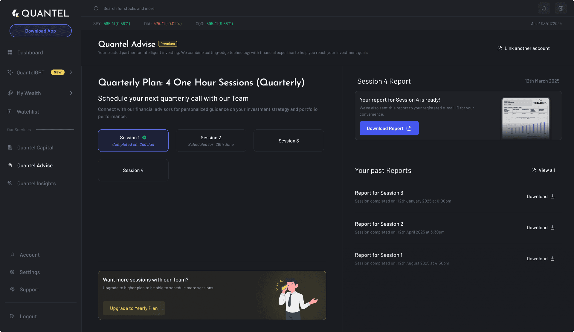


A central hub for every report
In their offline sessions, after each advisory session, Quantel’s experts create a detailed report for the user’s portfolio. When ready, this report is then sent to user via email or other means. So for the WebApp, we wanted to offer the user a central place for all the reports where users can view, download, and compare every past portfolio audit in one place.
Quantel Insights
Quantel Insights is the platform's research powerhouse. While Invest and Advise focus on management, Insights is where Quantel's proprietary AI truly shines, it tracks thousands of stocks across S&P 500 and NASDAQ in real-time to deliver actionable insoghts.

We designed the Insights landing page to act as a discovery engine. We curated Quantel's AI suggestions into intent-driven categories, like High Growth, Value Plays, Dividend Kings.
(For non-subscribers, this page showcases the AI's potential and clearly marks what's behind the paywall.)

The core UI challenge in this section was representing "AI confidence." We used a mix of color-coded signals and relative performance metrics to help users quickly identify whether the AI was suggesting a Long, Short, or Neutral position.
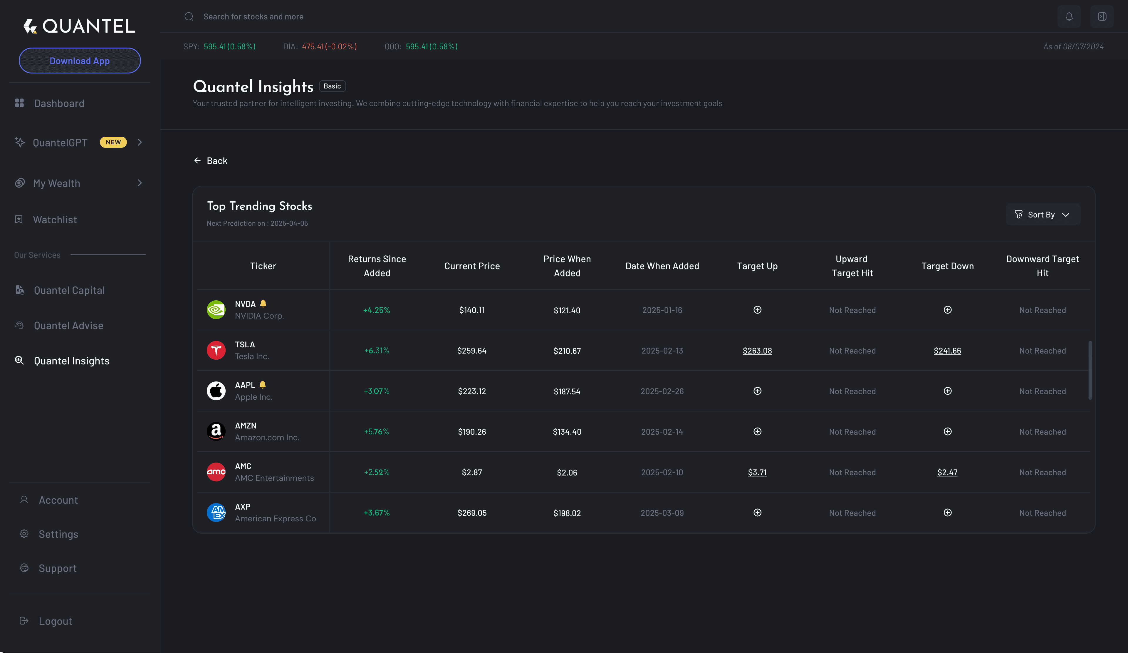
When a user selects a category, they are presented with the "Deep Dive" view. Here, we prioritized high-density data without sacrificing scannability. We refined the stock list UI to include essential filters, like sector, market cap, and relative performance, allowing users to cross-reference AI signals with their own research.
The goal was to provide a professional-grade research tool (similar to what an institutional trader might use) but wrapped in an interface that feels intuitive for the everyday investor.
Asset Details screen
A key part of our "All-in-One" vision was ensuring that users never had to leave the Quantel ecosystem to perform deep technical research. Typically, investors jump between their brokerage and platforms like TradingView to analyze charts and this didn't align with the business goal.

The Foundations
Below are the designs for some intermediary screens which basically acts as a junction that binds all flows together.
"My Wealth" Screens
A key part of our "All-in-One" vision was ensuring that users never had to leave the Quantel ecosystem to perform deep technical research. Typically, investors jump between their brokerage and platforms like TradingView to analyze charts


Watchlists
In a market that moves every millisecond, clarity is a feature. We kept the watchlist UI extremely clean, using a table-based layout that prioritizes scannability.

Why understanding “How APIs work” is important for designers
APIs define how data is requested, received, and updated, so knowing their structure allows designers to anticipate loading states, error handling, and data limitations or any potential constraints. It helps us design interfaces that are both user-friendly and technically feasible. This also leads to more realistic wireframes, smoother collaboration with developers (trust me, the devs will thank you for this, ours did!), and overall a better user experience.
How we used API data
Our developers had setup a Dummy user account for us (for testing/audit) and also provided us with the raw API Json data for the screen we demanded.
Our goal was to reduce cognitive load and surface the most actionable financial info first.
Let’s consider the Credit Card details screens for example, although the raw JSON data has many technical details, a user typically cares about - what to pay, when to pay, and how much interest they're paying.
"credit": [
{
"account_id": "dVzbVMLjrxTnLjX4G66XUp5GLklm4oiZy88yK",
"aprs": [
{
"apr_percentage": 15.24,
"apr_type": "balance_transfer_apr",
"balance_subject_to_apr": 1562.32,
"interest_charge_amount": 130.22
},
{
"apr_percentage": 27.95,
"apr_type": "cash_apr",
"balance_subject_to_apr": 56.22,
"interest_charge_amount": 14.81
},
{
"apr_percentage": 12.5,
"apr_type": "purchase_apr",
"balance_subject_to_apr": 157.01,
"interest_charge_amount": 25.66
},
{
"apr_percentage": 0,
"apr_type": "special",
"balance_subject_to_apr": 1000,
"interest_charge_amount": 0
}
],
"is_overdue": false,
"last_payment_amount": 168.25,
"last_payment_date": "2019-05-22",
"last_statement_issue_date": "2019-05-28",
"last_statement_balance": 1708.77,
"minimum_payment_amount": 20,
"next_payment_due_date": "2020-05-28"
}
]
How we leveraged this data to our benefit?
We categorized this data into several groups. We first collected all important data necessary to be shown in the UI, then further categorised them into more specific groups as shown in an example below:
Initial dump of all the important data points picked from the API response
Important data points
Card Balance
Next due date
APR
Available
Current cycle Payment status
Minimum Payment
Last Statement Balance
Last Payment
Interest rate
Prioritizing data points on the basis of “Importance to user”
What matters most to the user?
Card Balance
Next due date
Available
Current cycle Payment status
APR
Minimum Payment
Data points important for user to make Quick and Actionable decisions
Information to show upfront
(My Wealth > Liabilities)
Card Balance
Next due date
Available
Current cycle Payment status
APR
Minimum Payment
Insights
This activity, helped us to quickly get answers to questions like:
What data is requested?
What data is Updated?
How frequently the UI needs to be refreshed?
What structure should it follow?
What information is to be prioritized (<- the most important one!)
Mapping the API data to the Frontend
We then started designing the UI and mapping the data points. We clearly documented → “which field in the API data drives what content in the UI design”

One such screen where we used API Data mapping and the categorizing technique was the Credit card details screen. We designed the entire UI of the page around the API data, but separated the data points into different widgets to visually show the information in a much more simpler way. Also, we then kept the layout consistent for the other Assets and Liabilities screens too.

Outcomes and Impact
Here are the outcomes and impact of Quantel Asset Management platform since its launch:
Performance Outcomes:
Outperforming Benchmarks: Many portfolios managed or advised by Quantel have achieved over 50% returns over the last 18 months, consistently aiming to beat the S&P 500.
Significant Portfolio Growth: One specific case study of a director with an IRA account showed an account value growth from $1.11 million to $1.52 million in 12 months, representing a 36.83% return compared to the S&P 500's 20% return during the same period.
Wealth Creation: In that same use case, the client realized an additional $122,000 in value above the S&P 500 performance, which is projected to compound into an extra $500,000 by their retirement.
Client Impact:
Peace of Mind & Confidence: The system helped clients transition from feeling "overlooked" by traditional, generic 60/40 model advisors to feeling they have an advantage similar to the ultra-wealthy.
Early Retirement: One client reported being on track to retire 5 years earlier than originally planned due to the disciplined, data-driven approach.
Better Oversight: Clients gained the ability to perform a health check on their portfolios, identify risks, and execute corrective actions, whether they manage the money themselves or have Quantel manage it for them.
My learnings and reflections
I realized that rigid, standard UX methodologies often break under the weight of complex projects. Letting each team suggest their ideal workflow and merging them into a custom process was far more practical and effective.
Coming from a Tech background, I already understand how data is requested and updated and this knowledge helped my design approach. It allowed me to anticipate technical constraints early, resulting in highly realistic wireframes and a much smoother collaboration
From my past experience, I knew that designer and developer trust is absolutely non-negotiable. Staying close to the engineering team from day one kept my designs grounded in reality and saved significant build time which avoided costly workarounds.
Dealing with dense financial data taught me the importance of prioritization. By breaking data into digestible blocks, we can retain all essential information while making it much easier for users to digest and interact with.
Thanks for reading till the end!